
“Accessibility” is the inclusive practice of designing so people with disabilities can engage equitably. According to Census Bureau data, nearly 30 percent of people in the United States and about one in six worldwide have a disability.
As a public institution, the University of Michigan must comply with the accessibility standards set by WCAG 2.1 (Web Content Accessibility Guidelines). Even more importantly, making content accessible is an essential part of our culture of inclusion at U-M, and another example of our commitment to diversity, equity and inclusion.
DIGITAL ACCESSIBILITY
Accessible technology has led to innovations like Siri, speech-to-text dictation, touchscreen devices and much more. It’s helped increase usability and improve user experience, and improved the quality of code. And accessible design often breeds innovative technology.
If you have digital accessibility questions, please contact accessibility staff via the accessibility help form or check the Information and Technology Services (ITS)’s Accessibility webpage for Content Creators & Presenters. If you would like to stay current on disability initiatives, there is a self-register digital accessibility community on campus you can contact. To register yourself for the group, please use the MCommunity web application.
Some content in this section was adapted from the ITS Accessibility website.
PRINT ACCESSIBILITY
Most people think of websites when they think of accessibility. However, we believe printed materials should also be created with accessibility in mind. And there are things U-M communicators can and should be doing to achieve that objective. Since the ADA does not yet provide guidance about print, the recommendations below are based on the best practices of U-M accessibility and design experts.
Overall, we aim to create attractive, legible and readable materials to engage the widest range of users. This means considering accessibility throughout the design process and being open to requests for alternative versions.
The best way to ensure accessible print materials is to offer alternate modalities — electronic files, audio versions, Braille, large-print or alternate-contrast versions (such as low-contrast versions or reverse-contrast type versions) — and advertise the availability of those alternatives.
U-M has partnered with Allegra Marketing, Print, Mail to establish a process for creating accessible print documents. For guidance on preparing print files for conversion to an accessible PDF suitable for print, refer to Allegra’s tip sheet for creating accessible PDFs.
You can also improve your print materials by following these guidelines:
Fonts
With so many different font styles, it’s impossible to pick a minimum size to ensure readability. However, the following general principles can guide choices and implementation of fonts that promote accessibility:
NEW: See the typography page of this website for information about Atkinson Hyperlegible, the Braille Institute’s new typeface for the visually impaired. You can also download the font for free from Google Fonts.
Legibility
Sans serif is more readable: Use a sans serif font for the main body of text whenever possible. Serif fonts may be used sparingly, but avoid those with dramatic thicks and thins and exaggerated serifs. Fonts with large x-heights are easier to read. (X-height refers to the height of the lowercase x for a typeface. Typefaces with tall x-heights have better legibility at small sizes, because the white space within each letter makes it more legible.)
Minimum text size:
- Body text: Adjust your font size to what would be the equivalent of 12-point Arial for body copy. If you must use smaller type, make sure it has a large x-height
- Footnotes and photo credits should be no smaller than 8-point
- Leading: Set the space between lines of text (also known as ‘leading’) to at least 20-25 percent greater than the font size. If you use a 10 point font, the space between the lines should be 12 points or more. Extra leading helps readers maintain their place and move smoothly through content.
Avoid italics and all caps. Be sure underlining does not connect with the bases of letters.
Avoid hyphenation. While primarily an issue for people with cognitive impairments, hyphenation can also be an issue for those with low vision.
Simplicity
Number of fonts: A maximum of 2-3 fonts per page or document is recommended. Apply one font style to all body text and have distinct font styles for headings at each level. You can see this principle on this webpage, where our heading level 1 font (“Accessibility”) is distinct from our heading level 2 font (“Digital Accessibility”). This makes it easy to identify sections of the document at a glance.
Set type flush left/ragged right, since using justified text can decrease readability. Optimum line length is 8–12 words (approximately 60 characters).
Contrast
In general, use dark foreground text on a light background, or vice versa. Some studies have shown that legible white type with ample leading on a dark background makes for a more comfortable read. Either way, there should be at least a 70% difference in color value between background and text.
Colors behind dark type should be no stronger than 20 percent.
Use color contrast checking tools like the Web Content Accessibility Guidelines 2.X Success Criteria 1.4.3 Contrast (Minimum) or WebAIM’s color contrast checker to test contrast against common standards. Do not rely on color as the only means of communicating information. Be sure to use alternative options as well, like symbols, patterns or additional text identifiers.
Accessible Data Visualization
When designing accessible data visualizations, many only think of red-green colorblindness; but there are many types of colorblindness, including monochrome and low vision. The color palettes below (nearly) meet the needs of all.
To create relatively accessible charts and graphs, where color rather than pattern is necessary, the following data visualization palettes have a contrast ratio of at least 3:1 among adjacent colors, as described in the WCAG 2.1 success criterion for non-text contrast.
Downloadable template files are available via the Equity, Civil Rights, and Title IX Office (ECRT), for both Microsoft Office and Google Suite for four common graph/chart types using these data visualization color palettes.
Qualitative Data Visualization Palette
This palette is designed for data visualization that is categorical in nature. Each color will represent one category in a set with no inherent order, such as race or gender.
- Using the Color Contrast Analyser, contrast was tested between adjacent colors using Coblis
- The “Recommended Sequence” is the most ideal order to ensure all colors have sufficient contrast with neighboring colors. Sequences may be slightly adjusted if the pairs of colors in the “Contrast Errors” column are not adjacent.
- The “Contrast Errors” list bad pairings.
6-Color Palette (Recommended Sequence)

Contrast Errors (Avoid using these colors next to each other)
- Tappan Red / Angell Hall Ash
- Michigan Maize / Angell Hall Ash / Wave Field Green
- Michigan Blue / Tappan Red / A2 Amethyst
- Angell Hall Ash / Wave Field Green
Sequential Visualization Palettes
Sequential charts are used for inherently ordered or numeric values.
These colors do not reach the 3:1 contrast ratio with their neighbors. However, overemphasis on contrast can cause accessibility issues when reading inside the visualization itself. Therefore, a higher range of shades used within a single-hue palette may be more accessible (Source: Accessibility and The Sequential Palettes, A Case Study on IBM’s Color Palettes).
The blue palette is better suited for white backgrounds. The maize is better on black. Use a white or black background versus color to increase contrast with most shades in the sequential palettes.
These sequential palettes were validated to be colorblind-friendly with Chroma.js.


Diverging Data Visualization Palette
Diverging visualizations represent two extremes that meet in the middle at a neutral or meaningful value, or acceptable threshold (e.g. zero, passing, etc.)
Diverging visualizations represent two extremes that meet in the middle at a neutral value.
This diverging palette was created and validated to be colorblind-friendly with Chroma.js.

Other Recommendations to Consider
Use divider lines between colors to help define their shape.
Label charts near the category rather than solely on a legend.
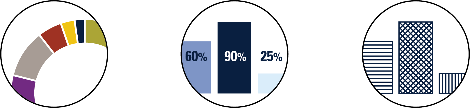
Textures and patterns increase accessibility of data visualizations.
Design
Readability
Paper stock: Bright white or glossy paper can produce excessive glare. Choose a dull-finish, smooth paper—heavy enough to prevent showthrough if your piece is two-sided.
Limit decorative fonts and type-on-path text elements. Make sure any words treated decoratively are repeated within the main body of text.
Try to avoid placing text over photographs, illustrations or other busy backgrounds. It can be difficult to ensure enough contrast against non-solid backgrounds.
Simplicity
If folds are necessary, they should be simple and intuitive, like these popular paper folds.
Content organization and structure: Keep the organization of content straightforward. Use headings to break up copy and enhance comprehension. Make sure headings are descriptive of the text following them.
Ensure paragraphs have consistent letter spacing and word spacing. Set type flush left/ragged right; justified text can decrease readability. Optimum line length is 8–12 words (approximately 60 characters).
Avoid visual clutter and maximize negative space. People with low vision and those with cognitive disabilities benefit from ample negative space. Leave ample negative space.
Language
Language
Learn more about recommended tone and terminology on the editorial resources page.
Know your audience! Write for them, not for “experts.” There are many resources that can help, including Writing Clearly and Simply by WebAIM. In general:
- Keep the message short and simple.
- Use short sentences, paragraphs and sections.
- Avoid complex words and sentences.
- Avoid acronyms entirely when possible. If you do need to use them, be sure to define and/or spell them out at least once in the content, generally at the first mention.
- Steer clear of industry jargon and confusing jargon. Use words your audience will relate to and understand.
- Shorten and clarify complex material.
- Break up copy using headings to help readers navigate through content. Headings should be descriptive of the text that follows them.
- Use the active voice instead of the passive.
Planning
Welcome Accessibility
The University of Michigan values diversity in all forms. It is up to us to create a culture of caring and accountability around accessibility. Create plans for providing alternatives, and develop processes that members of the community can follow to request accessible materials.
Increased Budget
Plan for adequate paper size and stock, high-quality images, alternate formats and the extra time and funding needed for creating additional formats.
Extended Schedule
Allow sufficient time for the creation of alternate formats — including proofing and review by an accessibility expert.