Typography is a powerful tool. When used effectively, the right font commands attention, elicits emotions and above all, creates a voice. It’s why typography is such an essential component of our brand’s visual identity.
A note about “Victors”: The proprietary Victors font, which was developed by Michigan Creative, was specifically optimized for the words “University of Michigan”; it was not designed for long-form reading and therefore is not available for general use.
How to choose a typeface
Legibility
Legibility refers to the design of the typeface — the width of the strokes, whether or not it has serifs, the presence of novel type design elements, etc. It is easy to tell one letterform from another in a legible typeface.
- Choose typefaces with conventional letterforms.
- Choose typefaces with generous spacing.
- Choose typefaces with a tall x-height (the height of lowercase letters in relation to uppercase).
Readability
How your typeface is set, combined with the basic legibility of the typeface, yields a certain level of readability. In most cases, communication comes before style — form follows function — so resolve readability first.
- Choose typefaces that were designed for your purpose. If a typeface was designed for signage, it probably isn’t going to work well set as the body copy of a book.
- Align text to “ragged right” for comfortable word spacing online to avoid “rivers.”
- Make sure the leading (the amount of space between lines of text) is greater than the point size of your typeface.
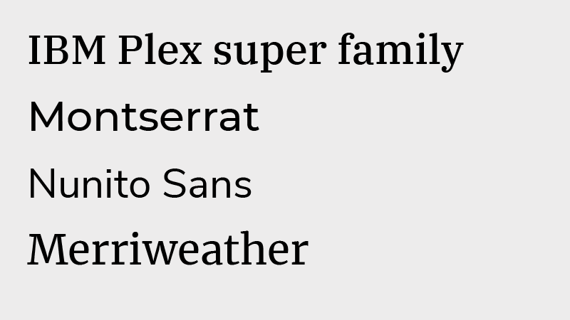
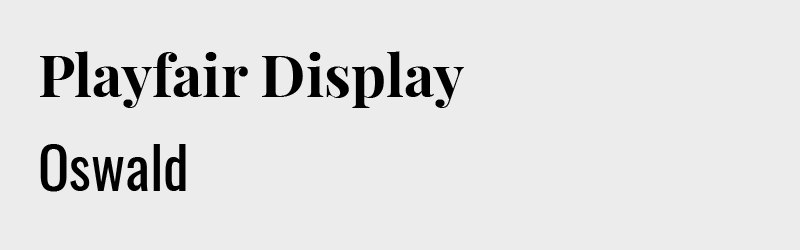
Font Recommendations
NEW: Atkinson Hyperlegible is the Braille Institute’s new typeface for the visually impaired.
Named after the founder of the Braille Institute, Atkinson Hyperlegible was developed specifically for readers with low vision.Read more about it in Print Magazine.
Download it for free from Google Fonts.