
Maintaining Clear Space
Always position the logo for maximum impact and give it plenty of room to help to ensure visibility and legibility.
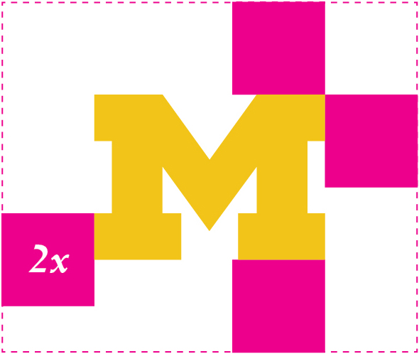
The minimum clear space for the University of Michigan logo is defined as twice the height of the block serif. Understanding the clear-space rule is essential, as it is also the standard for logo position and scale on most printed communications. In that regard, the clear space rule should be maintained as the logo is proportionately enlarged or reduced in size.
A note about taglines. Units will sometimes want to add a tagline or other messaging to the logo. While you are free to add additional copy to your marketing materials, the clear-space guidelines also apply to taglines, which cannot be “locked up” to a logo. Make sure any additional messaging is separate from the logo.
x = internal breathing space based on the size of the serif
2x = external safe space to aid readability and ensure no other graphic becomes visually attached to the official identity
2x = external safe space to ensure nothing comes close enough to make the Block M look like part of a larger graphic
Minimum Size
When reproducing the primary logo, be conscious of its size and legibility — a signature that is too small ceases to serve any useful communication function. The primary logo should never appear less than 3/4″ tall in printed materials, and no less than 75 px tall in the digital realm. A unit logo may be reduced 3/8″ tall in print, and 36 px digitally.
Print: 3/4″
Web: 75px
Print: 3/8″
Web: 36px
Guidelines: Primary Logo
GUIDELINES: BRANDED LOGOS VS. GRAPHICAL MARKS
Most official schools, colleges and units of the University of Michigan are eligible for branded unit logos.
On occasion, a school/college/unit will want to use a graphic in addition to its unit logo.
Using non-branded graphic marks is only allowable for limited-time purposes such as one-time conferences or other events, or for specific time-limited initiatives (eg the university’s Bicentennial mark).
It’s important to use branded logos in all marketing communications materials, including but not limited to websites and other digital media, signage, ads and print collateral. Leveraging U-M’s trademarks strengthens marketing outreach efforts, and helps ensure that institutional messaging is cohesive.
No other graphic should ever replace an official branded logo.
GUIDELINES: CO-BRANDED LOGOS
Occasionally, the university partners with outside entities, creating a need for a “co-branded” logo presence.
The following guidelines have been developed for this situation.
- For general use:
- The U-M primary logo should be positioned first, followed by the partner logo
- There must be clear space equaling the width of the logo between the U-M and partner logo
- There should not be any graphic elements in the clear space between the two logos

For use where space is limited:
- The Block M should be positioned first, followed by the partner logo
- There must be clear space equaling the width of the Block M between the Block M and the partner logo
- There should not be any graphic elements in the clear space between the two logos

PLEASE NOTE: The U-M logo consists of three parts: the yellow Block M (aka the secondary mark), the white “University of Michigan” line and the blue box surrounding those elements. The blue box is an essential component of the logo and must appear wherever the logo is used.
You may not alter the logo in any way. Specifically:
Guidelines: Secondary Logo
You may not alter the mark in any way. Specifically:
REPRODUCING LOGOS WITH LIMITED COLOR
Ideally, logos would always be reproduced in full color. But when that’s not possible, maintaining adequate contrast between logo and background is paramount. When working against a light background, one-color logos may be reproduced in Michigan Blue or black. Dark backgrounds can support Michigan Maize or white logos to maintain acceptable contrast. This handy PDF shows examples of each.
BLUE BLOCK Ms
You may have noticed that there are no blue Block Ms on this website, or in any of the logo kits. That’s because blue Block Ms are not part of the brand standard.
Blue Block Ms are allowed, and may appear on commercially licensed apparel and products as well as in other applications, but are not recommended: the preferred colors for the Block M are black, yellow and white. Email idstandards for details.